The task of developing an identity for Agro Epigenetics Corp began with choosing an appropriate typeface which would go on to serve as the basis point of both direction, and visual aesthetic.
Choosing the right typeface underwent many considerations. Some were playful,
some were ambiguous, but only one communicated
strength, organization, and simplicity
The inclusion of an emblem (DNA helix), was put in place to further denote the services of the
company and add a complementary depth
to the type dominant identity.
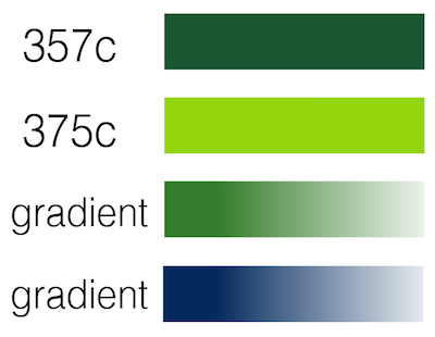
The composition was styled using Pantone solids
in addition to color progressions.